10 Car Colors That Just Didn’t Click

Have you ever seen a car color that made you wonder, “What were they thinking?” Some shades just don’t vibe with the road, and this list is all about those odd choices. With hues that stand out a bit too much, here are ten car colors that didn’t quite land.
Mustard Yellow Gone Wrong

There’s yellow, and then there’s mustard yellow. The shade aimed for boldness yet somehow ended up resembling a forgotten condiment rather than a fresh paint job. Instead of popping on the road, it kind of blends in, and not in a good way.
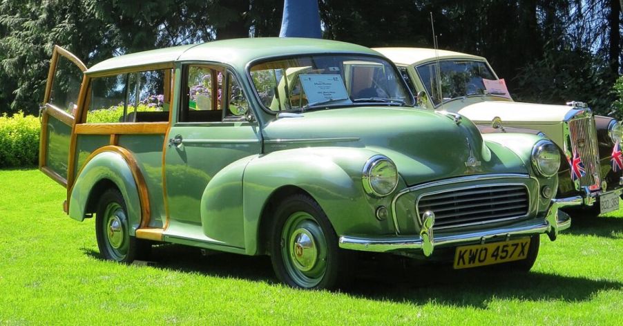
The Odd Appeal of Pea Green

Pea-green doesn’t really scream “cool ride.” On vegetables? Great. On cars? Not so much. An earthy shade like this often misses the energetic appeal most people want in car color, making it a rare and frequently overlooked choice in showrooms.
Baby Pink Not for Everyone

Pink might be perfect for bubblegum or Barbie, but for cars? Baby pink just didn’t fit the bill. Soft, subtle tones rarely catch the eye, which isn’t what most drivers seek. Don’t expect to see many on the road.
Neon Orange Overkill

Not simply orange but a bold neon orange. Think construction cones bright. Color choices like this one are tricky to pull off unless the goal is to turn heads—sometimes for the wrong reasons. It was too loud for some, and the shade didn’t hang around for long.
Pale Beige Bland Choice

Beige is safe, almost too safe. This pale version lacks the warmth or flair that might make it appealing on the road. Instead of a unique look, it tends to blend in with the pavement. Unsurprisingly, it’s a shade that didn’t really catch on.
Chartreuse That Confuses

This bold yellow-green mix stands out instantly, though often in ways that leave people second-guessing. It’s the kind of color you’d expect on highlighters, not highway cruisers. Most drivers passed on this one, making it an unusual and uncommon choice.
The Mismatched Bright Teal

Teal is a great color for beach gear, but on cars, it’s a different story. It’s bright, sure, but maybe a little too bold for most drivers. More at home on surfboards than on sedans, the shade clearly misses the mark for a car.
Sunburst Yellow Eyesore

Sunburst yellow was supposed to be bright and fun, but it ended up looking like a bit much. It’s so intense it almost hurts to look at it, especially on a sunny day. Eye-popping as it was, the shade failed to make a lasting impression.
Brown That Lost Its Shine

Once thought of as classy, brown eventually fell flat. It aimed for a rich look but often came across as outdated instead. Many drivers swapped it out for fresher colors, leaving brown in the rearview mirror, literally.
Metallic Mint Misfire

Mint green brings a fun, fresh vibe, but the metallic version lost some of that charm. Rather than looking sleek, it often felt out of place on the road—more eye-catching than stylish, which explains why it’s a rare pick among drivers.


