BMW Changing Its Logo on All of Its Vehicles in February, but Most People Won’t Notice the Difference
BMW is changing its logo. The company will start putting it on all of its vehicles, beginning in February. It looks nearly identical to the logo it is replacing.
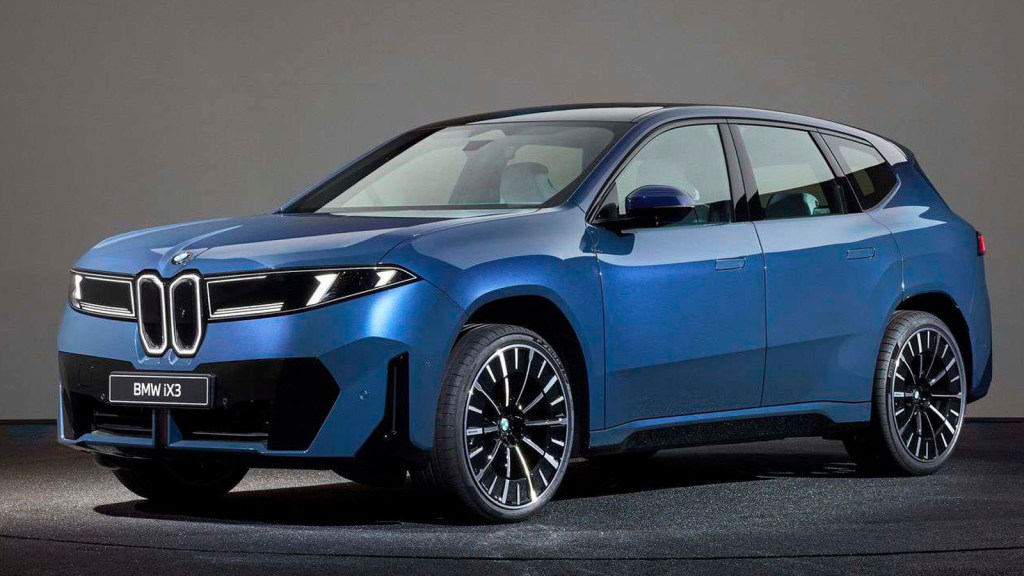
In fact, the new BMW logo is so similar to the logo it replaces that it was on the hood and rear door of the company’s new iX3 EV this past September, and not many people noticed.
According to BMW Blog, the differences between BMW’s old logo and the new one are the absence of the inner chrome ring and the removal of the chrome outline around the flag.
“The blue and white now appear to have richer hues,” writer Adrian Padeanu wrote. “Additionally, the black ring has switched from a glossy finish to a satin matte. While earlier plug-in hybrids and EVs featured a light-blue outer ring to visually distinguish them from combustion-engine models, that’s no longer the case.”
Why is BMW changing its logo?
“We wanted to preserve the heritage but give the logo more precision,” BMW design chief Oliver Heilmer explained. “The chrome is still there, the letters have been refined with a shiny pattern that you often find on watches, and the white surfaces are now closer to the outer ring. It’s flat, but when you touch it, you can still feel the ridges.”
Padeanu also reported that someone told him that a “changeover to the new M logo” will also take effect next month. However, BMW has yet to reveal how the company will alter it.


