The History and Meaning of the Mercedes-Benz Logo
The Mercedes-Benz logo is not just an iconic symbol in the automotive world. It’s one of the most recognizable logos in any industry. Logos have changed over the years, although some more dramatically than others. However, the Mercedes-Benz logo has a basic shape that’s been largely unchanged for over a century. In fact, the logo is older than the name “Mercedes-Benz.”
The history of the Mercedez-Benz logo
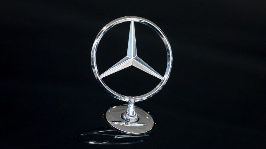
The iconic three-pointed star we all recognize as the Mercedes-Benz logo was first conceived back in the 1870s. Gottlieb Daimler, a co-founder of Daimler Motors Corporation, sent his wife a postcard with a three-pointed star drawn on it. Daimler wrote, “One day, this star will shine over our triumphant factories.” The three points of the star represent the company’s aspiring dominance of land, water, and air.
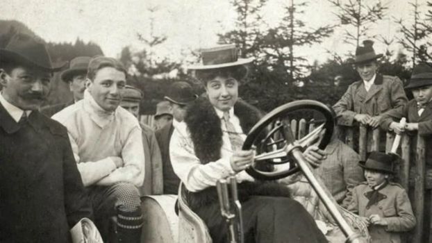
The first successful production car for Daimler Motors was called the Mercedes. It was named after the daughter of Emil Jellinek, who commissioned Wilhelm Maybach (the other co-founder of Daimler Motors) to design and build the car. Jellinek sold these Mercedes models, and they were a huge hit, eventually making the “Mercedes” name famous.
The evolution of the Mercedes-Benz logo
The first version three-pointed star logo appeared on cars starting in 1910, according to the Mercedes-Benz Group. It was proposed for use as a trademark by Paul and Adolf Daimler, the sons of Gottlieb Daimler. Before that, the Mercedes logo was simply the word “Mercedes” in an oval shape, not unlike the Ford logo.
The next step of the Mercedes logo came in 1916. A red and black circle was added along with the name “Mercedes” along the bottom and four additional stars. The simpler star in the circle logo was first trademarked in 1921 and was commonly used as a radiator emblem on Mercedes cars.
In the German economic crisis that followed World War I, Daimler Motors merged with Benz & Cie. in 1926. The resulting company was Daimler-Benz AG, and the name of its automotive line was Mercedes-Benz. The new brand needed a new logo, which incorporated the laurels of the Benz logo from before the merger, according to MotorTrend. This familiar round logo with the star, laurels, and the “Mercedes-Benz” name is still in use almost a century later.
So, what about that classic “Mercedes-Benz” font? The star logo with the now-familiar font associated with the brand became the official logo for Mercedes-Benz in 1989. It used a 3D-looking version of the star and circle emblem with no laurels. This design was updated but essentially unchanged in 2010.
Speaking of font, the electric Mercedes-EQ line uses a pretty distinct “EQ” font in its logo. While we expect the EQ line to continue expanding, we don’t think the legendary Mercedes-Benz star is going anywhere.
The MB star is a symbol of excellence
Although the Mercedes-Benz Group, in its current form, doesn’t have a presence in the air or the sea, it’s the world’s largest brand of luxury cars. The three-pointed star may have lost its original meaning, but today it’s a simple and recognizable logo with a well-earned reputation for automotive excellence.


