Lamborghini Logo Gets a New Look In Over 20 Years – Sort Of
Every once in a while, a major automaker will overhaul their badge to keep things fresh. For instance, General Motors (GM) did it to emphasize its electrification initiatives. However, it’s not every day that a tenured and highly sought-after supercar and hypercar marque changes its iconic badge. However, for the first time in decades, the Lamborghini logo sees some changes. But you might need to squint to make them out.
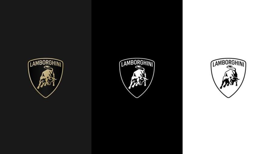
The Lamborghini logo gets its first update in decades, but it’ll still look familiar to the brand’s fans
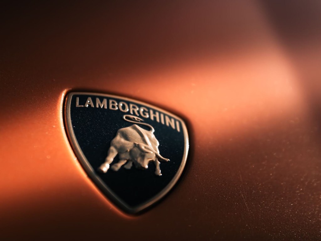
The Lamborghini logo is among the most instantly recognizable badges in the biz. Consequently, it’s right up there with Ferrari’s iconic Prancing Horse and Mercedes-Benz’s historic three-pointed star.
The Lamborghini badge’s formula dates back to the 1960s when Ferruccio Lamborghini instilled his love of bullfighting into a badge to summate his brand’s power and presence. Earlier interpretations worked in much of the same shape you see today. The triangular shape was always part of the package, along with the Raging Bull and its rightward orientation. Moreover, the “Lamborghini” script in the logo has transitioned back and forth between under the badge and on the badge above the bull.
Today, the iconic Italian marque has changed its badge for the first time since 1998. However, the changes aren’t as dramatic as you might think. At a glance, you might even miss the update. For starters, the brand’s bold upper-case script and Raging Bull remain in the same place within the triangular badge. However, the bull loses much of its three-dimensional appearance, instead going for a simplified look. Furthermore, the brand asserts that the new logo features a “broader Lamborghini typeface than its predecessor.”
Automobili Lamborghini claims that the new look is part of the brand’s initiative to “better reflect the ‘brave, unexpected, and authentic’ values of its mission.” According to the brand’s media page, “This revamped version of the logo becomes an integral part of the company’s distinctive identity and will also be applied on future cars.” However, a glance at the logo doesn’t reveal much of a dramatic update.