The History and Meaning of the Corvette Logo
Manufacturer and model logos and emblems like the Ferrari prancing horse, Ford’s “blue oval,” or the slanted “M” attributed to the sportiest of BMW models are emblematic (excuse the pun) of the brand or model’s history. Sometimes these emblems can change drastically over time, receive a refreshed look, or even revert to their previous style for marketing or nostalgia. Some emblems even reach iconic status, and certainly among that group is the iconic American sports car, the Corvette. So, what does the Corvette’s emblem represent, and how has it changed over the ‘Vette’s 70-year history?
What does the Corvette’s logo symbolize?
The Chevy Corvette’s emblem has undergone some significant updates over the past seven decades. Still, several elements have remained constant — dual flags, the Chevrolet bow-tie badge, and, in all but one generation, a fleur-de-lis.
The fleur-de-lis is perhaps the most unexpected element of the Corvette logo, given the sports car is a General Motors product and therefore is decidedly American. So, why does the Corvette logo incorporate the symbol of a tri-petal lily bound at its base, popularized by its former inclusion on the French coat of arms?
Though we may associate Chevrolet with the red, white, and blue — er, the star-spangled version, that is, considering those are the same colors featured on the French flag — its founder was from across the Atlantic.
Louis Chevrolet spent the first two decades of his life in his home country of Switzerland before settling in France, where he began tinkering with motors and developed his mechanical prowess. According to GM Authority, the fleur-de-lis was included on the Corvette logo as an homage to the country in which Chevrolet’s family descended and where he first made his mechanical strides before starting the company that bears his name in the U.S. in 1911.
The Corvette’s use of a black and white checkered flag, popularized by motor racing, is more evident given its sports car pedigree. However, the use of a second flag bearing the fleur-de-lis and often the Chevrolet logo was never originally intended to be included in the Corvette logo.
The original Corvette emblem that never saw the light of day, at least proverbially, called for the checkered flag to cross with a U.S. flag. However, due to legalities surrounding the use of the American flag on commercial products, the star-spangled flag was dropped and replaced by the fleur-de-lis and the Chevy logo-bearing banner.
How has the Chevy Corvette emblem changed?
The Corvette emblem has used similar styling cues over the last 70 years, but some notable changes have occurred.
The original logo featured crossed flags encompassed in a circle with “Chevrolet” above the flags and “Corvette” shown in a stylized script underneath. For the C2 generation, which debuted in 1963, the manufacturer and model script was removed, and the positioning of the flags was more vertical than the previous logo.
The C3 logo is an amalgamation of its predecessors. The flags were returned to a more horizontal position, though they now stretched beyond the “circle,” and the Chevrolet and Corvette wording remained absent.
The Corvette emblem made a dramatic design leap for the C4 generation (1984-1996). The “flags” were no longer as such, as the emblem then sported a hexagonal shape bifurcated with the black and white checker flag now on the left and the Chevrolet logo on the right on a red backdrop. Noticeably absent was the fleur-de-lis. Like the previous logo, the “flags” stretched beyond the circle design.
The traditional crossed flags returned for the C5 Corvette, though they now sported a new “wave” design. The checkered flag remained on the left, with the red flag bearing the Chevy badge and fleur-de-lis on the right, a motif that continues to the current logo.
The sixth-gen Corvette was introduced for the 2013 model year, and with it came another updated emblem. The V-shape of the crossed flags was introduced, the fleur-de-lis sported an updated look, and the surrounding circle was eliminated. It has yet to return.
The C7 logo’s V shape is more dramatic and sharper, with more angular points and a less blocky “wave” motion. The fleur-de-lis was also refreshed again, and both flags were wrapped in a silver border. The logo could also be had in a Carbon Flash finish, which replaced the silver frame with a black one with a gray/black checkered flag.
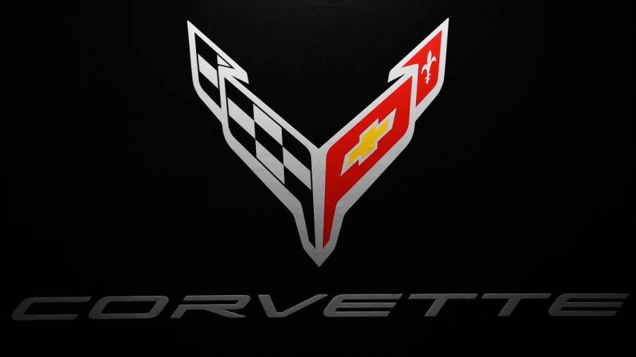
The current Corvette logo marks a new look for an all-new type of ‘Vette
The C8 Corvette marked a complete turning point for the sports car, as it switched to a mid-engine layout, and to mark the occasion, its logo was updated again.
The current Chevy Corvette emblem still sports the distinctive dual waving flags, though they no longer cross. Instead, they now form a V-shape similar to prior designs but originate from the same vertical axis. A line under the fleur-de-lis is no longer present, and it remains on the right side with the Chevrolet logo across from the checkered flag on the left. Like the C7 generation, the current logo is also available with a Carbon Flash finish.
With the likelihood of an all-electric Corvette coming down the pipeline, we will likely see the ‘Vette’s logo refreshed once again.


