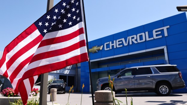
Why Is Chevy Known as the Bow Tie Brand?
Regarding the most recognizable emblems in automotive history, it is hard not to include the famous Chevrolet bow tie as one of the most iconic in the industry. Of course, Ford’s timeless script logo and Mercedes’ historic three-spoke star logo are iconic, but it’s hard to think of a logo more recognizable in shape alone than the Chevy bow tie.
But how exactly was this bow tie logo created? Is there any significance to the logo, and how has it evolved through the years? Here is everything you need to know about the Chevy logo and why Chevrolet is known as the bow tie brand.
Chevrolet was not always the bow tie brand
According to Logo My Way, the Chevy logo was not always a bow tie. In fact, the first logo had a lot in common with Ford’s logo. The first logo unveiled in 1911 was a logo that was based on the signature of Chevrolet co-founder Louis Chevy. However, this bold, blacked-out logo was short-lived; by 1914, it was no longer used.
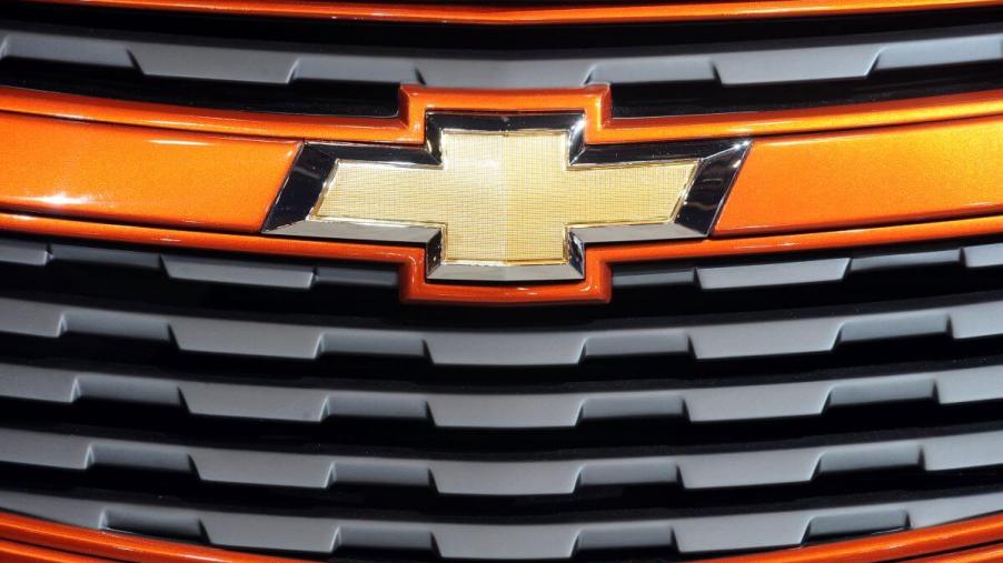
The first bow tie Chevy logo appeared in 1913, which was unveiled by Chevrolet co-founder William Durant. This first bow tie logo was white and light blue with a gold outline, and the Chevrolet company name was printed in the middle of the bow tie. This bow tie logo lasted in some form through the years until today, when it is still affixed to brand-new Chevy vehicles.
Who designed the bow tie logo?
In the early 1900s, having a company logo that was simply a signature of the company’s owner was not uncommon, so what led to Chevrolet adopting such a strange shape as its logo? For years, the rumor among higher-ups in the industry was that William Durant, Chveroelt co-founder, saw the bow tie logo on a strip of wallpaper while overseas. According to this rumor, he took a sample of the wallpaper home and drafted it into a logo. However, this is not the case.
According to Jalopnik, Catherine Durant, William’s wife, revealed that her husband was inspired by another company’s logo in a Hot Springs, Virginia newspaper in 1912. While this account confirms that another logo inspired the Chevy logo, there was just one mystery yet to be solved: What was the company logo that inspired William Durant’s design? After years of investigative work, Ken Kaufmann, Chevrolet historian, found an ad for Coalette brand coal with a logo resembling a bow tie and a company name with nine letters, just like Chevrolet. After finding out that this ad ran on November 12th, 1911, right at the inception of Chevrolet, there is a huge possibility that this is the logo that inspired William Durant all those years ago.
How has the Chevy bow tie logo evolved over the years?
After William Durant unveiled the bow tie logo in 1914, the logo went through a redesign in 1934, adopting an all-black monochromatic color scheme. In 1940, the logo returned to a white, light blue, and gold color scheme. In 1950, the Chevy bow tie adopted a polarizing design by having the emblem surrounded by a circle, but this logo was phased out by 1964 when the classic bow tie design returned. In 1988, the Chevrolet logo separated the logo from the company name, with ‘Chevrolet’ placed below the bow tie instead of inside. From 2001 through 2013, the word ‘Chevrolet’ disappeared from the logo, which was now only the bow tie design.
In 2013, the Chevrolet name was once again found on the logo, this time below the bow tie. According to GM Authority, the famous gold bow tie is found on most Chevrolet vehicles. Additionally, or nearly every vehicle in the lineup, an all-black logo is available, and on the Chevy Bolt EV and EUV, the black bow tie is standard equipment. The Chevy bow tie badge can also be ordered with an illuminated border, known as the ‘glow tie.’ Regardless of which Chevrolet badge is found on your vehicle, there is no doubt that this bow tie-inspired design is one of the most recognizable in automotive history.