The History and Meaning of the Porsche Logo
The Porsche brand is iconic for many reasons. One of those reasons is the recognizable logo that adorns every model and hasn’t changed very much throughout the brand’s history. You may have noticed a close resemblance between the Porsche logo of today and emblems on classic Porsche models as far back as the 1950s. So, what does the Porsche logo mean, and how has it changed over the years, if at all?
What does the Porsche logo mean?
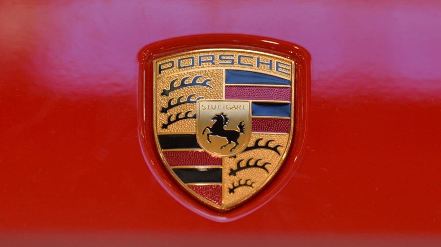
The legendary Porsche logo is a combination of the Württemberg coat of arms and the Stuttgart coat of arms.
The Weimar-era Württemberg coat of arms consisted of a shield with black antlers on a yellow background, black and red stripes, and two bucks. This coat of arms was a combination of the flag (black and red stripes) and the coat of arms (black antlers on a yellow background) of the Kingdom of Württemberg that preceded the Free People’s State of Württemberg. The Württemberg region is relevant because its principal city is Stuttgart, where Porsche is based.
The coat of arms of Stuttgart has long been a black horse on a yellow background, which is at the center of the Porsche logo. The etymology of the name “Stuttgart” has its roofs in the Old High German word “Stuotgarten,” which means “stud farm.” The city was founded by Duke Liudolf of Swabia in 950 AD with the intention of breeding warhorses. According to Porsche, the horse “symbolizes the power, agility, and elegance of Porsche cars.”
Obviously, the names “Porsche” and “Stuttgart” were added for the Porsche logo indicating the brand and the city where it’s proudly based. The logo was designed by a senior designer at Porsche named Franz Xaver Reimspiess by the commission of Ferry Porsche himself.
The history of the Porsche logo
The oldest iteration of the Porsche logo is from 1952, appearing on the steering wheel of the Porsche 356. The 356 was the first production car from Porsche, making it a fitting vehicle to debut the brand’s logo. It started appearing on hubcaps in 1959 and on hoods in 1965.
Porsche has tweaked its emblem over the years, with the latest revision debuting in June 2023, according to Motor1. The untrained eye won’t notice anything different. However, the most notable changes are the honeycomb texture in the res stripes and black lettering for “Stuttgart.” It still bears the familiar font for the “Porsche” name, the iconic black horse in the middle, and the Württemberg-inspired coat of arms.
The horse has also gotten a little more realistic in the newest version of the Porsche emblem. Its mane and tail look more like those of a real horse tail. By contrast, earlier logo versions had more of a classical coat-of-arms aesthetic.
The future of the German luxury brand
According to Electrek, Porsche anticipates that 80% of its sales to be electric vehicles by 2030. That’s all a part of Porsche’s Mission E electrification goal. So, will the Porsche logo be altered for this new EV age?
As the Porsche brand gradually electrifies, we don’t anticipate any significant changes to the Porsche logo. It’s a brand deeply rooted in tradition and heritage. The fact that its logo has barely changed in over 70 years reflects that.


