VW Will Announce New Logo That Looks Like The Old One
The more things change the more they stay the same. Volkswagen has announced that they will reveal their new logo at the Frankfurt Motor Show next month.
If you think you’ve seen it before you may have noticed it in their Hello Light ad for the ID Buzz Microbus EV. Then again, you might have noticed it before the current skeuomorphic logo. What’s that?
Skeuomorphic, Baby!
The skeuomorphic design takes a two-dimensional, flat presentation and shades it to look more realistic. More three-dimensional-like; just like the current VW logo. As much as we like the current logo and skeuomorphic designs, the trend in graphic design has been turning away from this for a decade.
Graphic designers feel that logos now need to be more simplistic without the extra bits of info it takes to show fading, edges, and shadows on computer screens. In other words like most logos before the 1990s. So if you think you’ve seen this logo before, if you’re old enough to remember Windows 95 you probably have. If you need a hint the new logo is the one on the right.
Once it starts appearing on actual Volkswagens the background will be glossy black as opposed to the matte black look of the printed logo. The only difference we see from the postwar logo is the outer ring will be slightly thicker. The first car to carry the new logo will be the eighth-generation Golf.
Current Logo Bowed In 2000
The current logo debuted in 2000 and was part of the then-trend of shading and lighting logos, adding highlights, shadows, and edges. Note that just about every car manufacturer came up with their own 3D-like logo around the same time. Graphically it was the thing to do. Now? Not so much. We are expecting most other car manufacturers will now switch back to the more flat, simple designs of decades past, or something extremely similar to their pre-1990 logos.
What is a bit puzzling is that the VW logo has stayed extremely similar to how it looked before WWII. Originally designed in the 1930s with a gear surrounding the stacked “VW” letters, the only element that has changed in over 80 years has been the gear. It was simplified to a circle.
Is New Logo Old?
So is the new logo the old logo? Is the old logo a back-to-the-future new logo? It’s hard to say. To be honest we don’t see much of a difference between the new 2020 logo and the one from the 1940s. See for yourself:
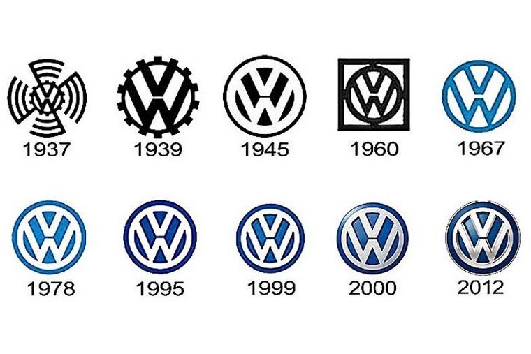
If you look at the logo from 1978 and the “new” logo, don’t they look the same? Yes, one is blue and the other black. But other than the color they look the same. So maybe VW’s logo announcement will be that the new logo is their 1978 logo all over again.
Service Logo
If you’re confused about the logo leading off this post, that’s the VW Service logo from the 1960s. It is yet another variation of the iconic VW logo.