Cadillac Logo: The History and Meaning of an American Luxury Brand Symbol
The original Cadillac logo was made to honor the family crest of Antoine de la Mothe Cadillac, who founded Fort Pontchartrain du Detroit in 1701. If the name seems familiar, it should. The area later became the city of Detroit and the home of the American automotive industry. What else do we know about the Cadillac crest?
What does the Cadillac logo mean?
The original Cadillac crest symbolizes pioneering and leadership. This logo has two distinctive parts, the coat, and the shield. The coronet symbolizes the six ancient courts of France. The pearls signify that the family is descended from the royal counts of Toulouse.
The four distinctive parts of the shield symbolize the bravery of the Mothe family in the first and fourth parts. The second and third parts were added to the Mothe coat of arms after a successful marriage.
“The coat of arms symbolizes pioneering and leadership in the automotive industry” – GM
When was the original crest first used?
According to GM Media, the original Cadillac logo was first used on cars in 1905. This crest, with its coat of arms, was registered as a trademark in 1906. It was used and evolved over many years as the symbol of an American luxury car brand.
Why was the original Cadillac logo too challenging?
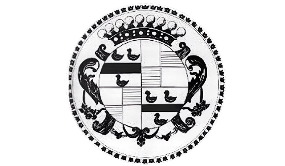
The crest trademarked in 1906 was simply too much for an automotive emblem. While made to honor the Cadillac family, the crown, swans, tulips, and circular lines were too feminine for a car company trying to communicate power and fierceness in the industry.
Eventually, after several attempts, the brand finally found a more contemporary version of the logo in 1933. This new logo showed a shield closed by a pair of wings. Using black in the shield made the entire logo more aggressive and modern for the time.
Did Cadillac change its logo?
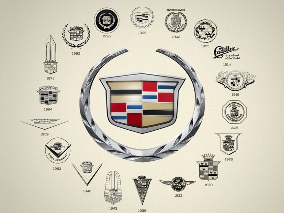
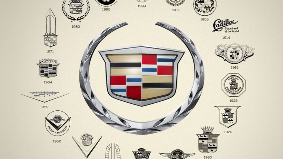
Although we think of many automotive logos as being timeless, that is simply not the case. Even the Ford blue oval has evolved over the past century-plus in the automotive industry. However, the Cadillac logo has changed more times than most would expect. Since the company first began in 1902, nearly 30 different versions of the Cadillac brand crest have been introduced.
What is the Cadillac symbol called?
The emblem of Cadillac has changed many times, but it has been commonly known as the wreath and crest. These elements have been present in the symbol in nearly all versions of the logo. Over time, the logo has changed to reflect the company’s design and culture changes. As Cadillac focused on staying ahead of the luxury market, the logo changed to reflect these changes.
Is there a new Cadillac logo for electric vehicles?
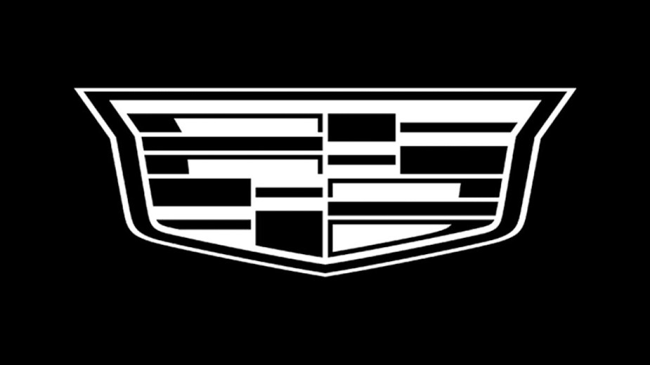
The movement away from gas-powered engines to electric vehicles brought another opportunity for Cadillac to change its emblem. This new logo features only the shield, which is entirely colored in black and white. This monochromatic version showcases the modern elegance Cadillac desires to show in its new EV lineup.
The current logo, a shield with colored bars, will continue to be featured on gas-powered Cadillac models until the production cycle has ended. As this brand transitions to an entirely electric lineup, the logo also transitions to this new black-and-white style.
Next, check out the Cadillac Escalade, or learn more about the Cadillac logo in this video below:
